

What Are Backlinks in SEO? Examples and Best Practices
Have you ever wondered what is backlinks in seo example? Imagine a backlink as a high five from one website to another. When a…
Read the guide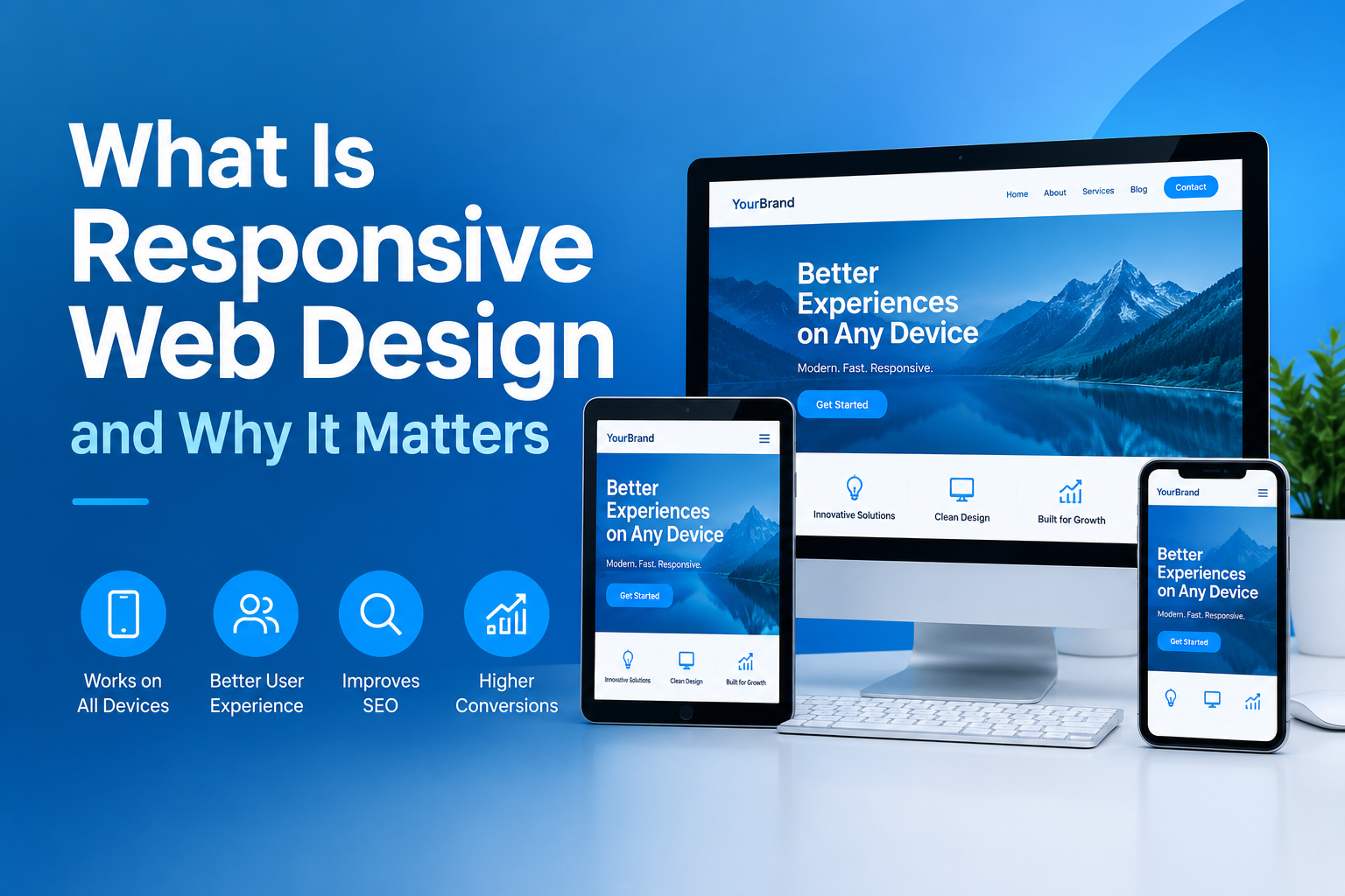
If a CEO opens your site on an iPhone while sitting in a Sheikh Zayed Road traffic jam and the text looks tiny or buttons refuse to click, you lost that client. It happens every single day across the UAE. Business owners spend tens of thousands of dirhams on digital marketing, only to dump that traffic onto a site that looks broken on anything smaller than a desktop monitor. Understanding what is responsive web design is no longer just a technical detail for developers it is a baseline requirement for doing business in the Gulf region.
When we talk about responsive web design, we mean building a site that fluidly scales, adjusts, and reshapes its layout according to the screen size and device orientation of the user. Whether someone opens your page on an Ultra-Wide desktop screen in a DIFC board office, an iPad, or a smartphone, the site shifts its elements dynamically. Instead of forcing visitors to pinch, zoom, and scroll horizontally, a properly engineered site delivers an intuitive layout tailored to their device.
To understand how modern sites function, you need to know the difference between responsive website design and adaptive web design. While both aim to solve the same problem, they go about it in very different ways. Adaptive systems detect the specific device being used and serve one of several fixed, pre-built layouts. If a new phone comes out with an unusual screen resolution, an adaptive setup often struggles until developers create a custom layout for that specific width.
Responsive sites take a far more flexible approach. They rely on fluid grids, flexible images, and CSS media queries to resize content continuously across any screen size. When we test client platforms on newly released devices, responsive layouts automatically adapt without requiring new code deployments. For Dubai companies aiming for longevity, this flexibility saves substantial maintenance capital over time.
The UAE boasts one of the highest smartphone penetration rates globally, with mobile traffic routinely accounting for well over 70 percent of total web visits across retail, real estate, and professional services. If your site lacks a mobile responsive web design, you are actively blocking seven out of ten prospective customers from reading your proposal or requesting a consultation.
Search engines notice this behavior immediately. Google uses mobile-first indexing, meaning its algorithms evaluate and rank your site based almost entirely on how it performs on mobile screens. If mobile users land on your homepage, encounter unclickable buttons, and hit the back button within five seconds, your organic search rankings will drop. A high-performing mobile-friendly website keeps visitors engaged longer, signals authority to search engines, and directly lowers your cost per acquisition across paid advertising campaigns.
Building an optimized site requires balancing visual elegance with strict technical performance standards. When auditing existing platforms, we look for several core structural elements:
If you are evaluating your current platform or planning a complete redesign, partnering with the Best Website Designers in Dubai helps ensure these core standards are executed accurately from day one.
In our experience auditing corporate sites across the GCC, the most common mistake is treating desktop as the primary design medium. Many teams review site prototypes on large office monitors, approve the visual layout, and test the phone view as an afterthought minutes before going live. This backward workflow leads to clunky navigation menus, hidden call-to-action buttons, and sluggish page speed on handheld devices.
Another frequent pitfall involves hiding crucial desktop content on mobile screens just to make the layout look cleaner. If a piece of information, price chart, or booking form is important enough for desktop users, mobile visitors need access to it as well. Rather than hiding content, smart layouts rearrange and prioritize information logically as screen width shrinks.
Open your site on a smartphone and test basic interactions like filling out forms, clicking navigation links, and reading text without zooming. You can also use developer tools in browsers like Chrome to simulate various phone and tablet screen dimensions.
Not if it is coded correctly. While responsive sites load CSS stylesheet rules for multiple layout states, proper image compression and clean asset delivery keep load times exceptionally fast.
For most businesses, a responsive site is far more cost-effective and accessible. Apps require users to download software from an app store, whereas a mobile site gives immediate access to anyone clicking your link or search result.
Your website is often the first impression a high-value prospect has of your business in the UAE. Now that you know what is responsive web design and how directly it impacts user retention, test your own site on a mobile device today. If you notice slow loading times, misplaced text, or difficult navigation, updating your design architecture should be your immediate priority. A seamless, high-performing digital presence ensures you capture every lead and protect your market position in an increasingly competitive landscape.
Fixed price, in writing
Got it. Your quote is being written now.
In business hours you will have it within 45 minutes. Check your inbox for the confirmation.
Keep reading
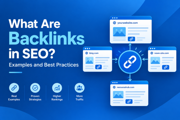
Have you ever wondered what is backlinks in seo example? Imagine a backlink as a high five from one website to another. When a…
Read the guide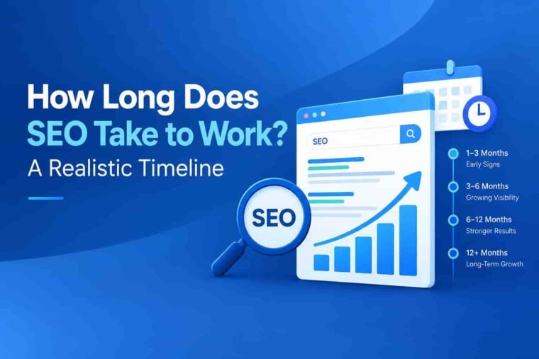
Understanding how search engine optimization operates helps you plan your business growth effectively. Many business owners ask how long does seo take to show…
Read the guide
Planning a website project in Dubai requires clear direction and local market awareness. Every company needs a strong online footprint to win customers. Choosing…
Read the guide